


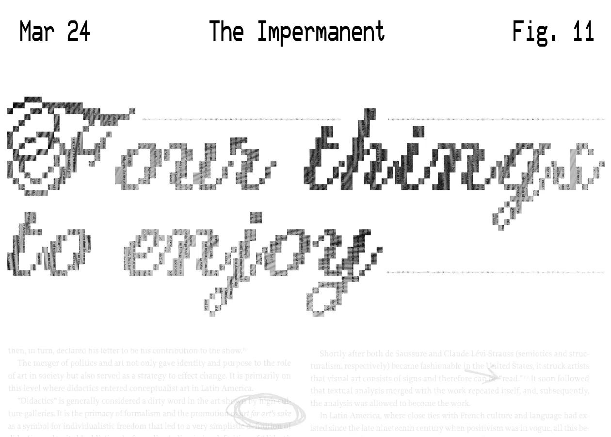
Four artworks to enjoy
Today, language and letters in mostly Latin American conceptual art.

This week the newsletter is coming from Itata, Chile, where I’m hard at work stomping and tasting grapes that will become the 2025 vintage of Vino Potable, my wine brand. Most of our grapes come from this historical organic vineyard that was founded by Jesuits, probably 200 years old, where you can barely see the grapes but some talented pickers are able to trim, select and give us some sweet, acidic, and beautiful grapes that we will turn into our Vino del Amor y Perreo or our new Hot Damn.
Today’s theme is inspired by a work project that I’m kicking off this week where I’ll be making diagrams about typefaces. I started to notice and think more about letters in general, and how they became the central piece in some modern and contemporary art. First I thought of the very famous Barbara Kruger artwork, Magritte’s pipe and the avant-garde Lettrism, but then some other pieces came to mind, more local to me, that I wanted to highlight here. I’m not enjoying making it four things instead of three, there’s an incomplete feeling to this edition of the newsletter, so maybe this is four things part one, I’d like to do more research and come back to it with more.
1. Colombia, Antonio Caro
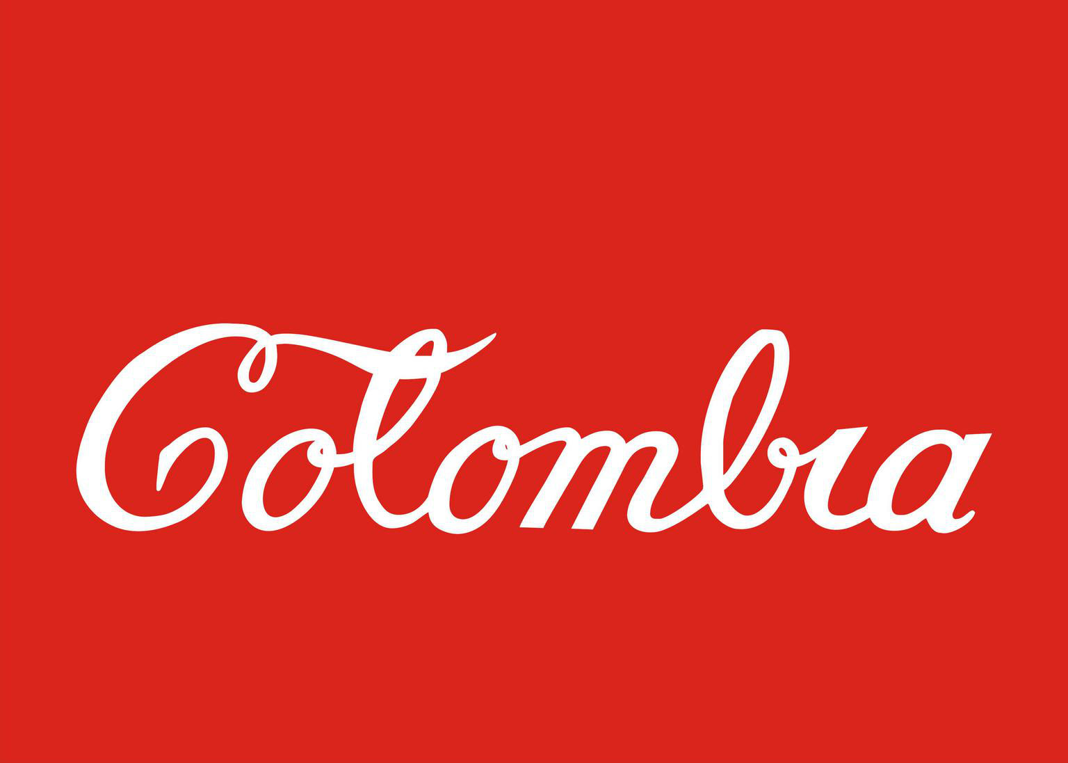
Antonio Caro developed his conceptual art in the late 60’s and 70’s in Colombia, and this piece in particular is one of his most famous and striking. For me, it speaks about the power of lettering and color in design and how it can be subverted to create this piece that critiques consumerism displacing local culture. Interesting to note here that unlike the next pieces, this one features a distinctive way of setting the tone and creating a context, again, with “just” lettering and color.
Heavily inspired by his mentor and friend Bernardo Salcedo, this artwork honors the heritage of Salcedo’s works: re-contextualize objects, in this case words (are words also objects?), through interventions that prioritize irony and humor with pointed social commentary. There’s so much to say about words as objects, and language, and objects through the lens of language, etc, etc, this is a fascinating subject to me that I would love to explore further.
2. This is a mirror, You are a Written Sentence, Luis Camnitzer
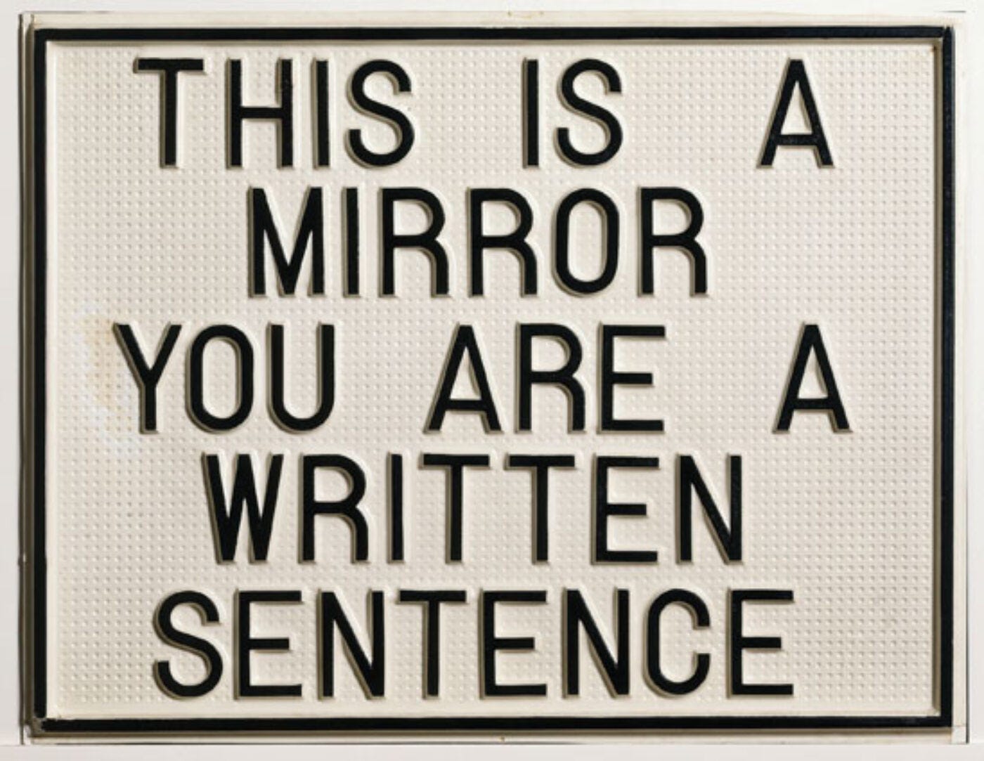
This is one of Camnitzer first conceptual works, inspired by Jorge Luis Borges and Magritte, exploring the reflective nature of language. There’s so much to say about this artwork. Not only it is talking about words as objects (“this is a mirror”) analogous to the aforementioned Pipe, but it is talking and poking fun at the impossible nature of the observer (“you are a written sentence”).
This piece offers a few philosophical questions: about being an object of reference, about words and the nature of things, about the nature of the artwork itself and what is a reflection. Again, there’s so much to say about it.
He’s a critic and an academic, in an interview he said that this piece is more of a method, analogous to Borges and Magritte work, and that is evident in subsequent works like “A museum is a school”. He states that “The Museum is a school; the Artist learns to communicate; The Public learns to make connections.”, making connections is key here, and what I like about the artwork, creates connections between words, concepts, objects which is what words do anyway, and what objects also do. I recommend reading the whole interview, is full of gems.
“Art has to be highly manipulative (or didactic in the best sense) to set the stage for viewers to reach the insight that you want them to reach in the belief that it all happened naturally and without coercion.”
Luis Camnitzer
3. A piece that is essentially the same as a piece made by any of the fi rst conceptual artists, dated two years earlier than the original and signed by someone else, Eduardo Costa

This piece is basically a theoretical statement by Argentinian Eduardo Costa, whose art enjoys touching the limits of genres, not only in pictorial work, also in sculpture and performance art. This artwork is weirdly self-referential as the past version of a future artwork made by someone other than Costa. Very humorous as well.
Out of the four pieces shown today, this one is the most abstract one, there isn’t much we can say about its aesthetic quality or technique, it is printed text on paper unlike Caro’s painted word or Camnitzer’s textural board. In this one, the words and content are the main character (no pun intended) and even though what is says is what we’re supposed to focus on, the text makes our attention wonder into a future and a past where there is an identical piece made by a different unknown author.
There’s a relation to Borges, Costa’s teacher, short story “Pierre Menard Author del Quijote”, where both authorship and imitation are discussed in a humoristic way, making us wonder who is the real author and what is the difference, if any, between the original piece and the imitation, as well as which one is the original and which one is the copy.
The de-centering of the author reminds me of the 1967 essay “The Death of the Author” by Roland Barthes, where he argues that the content of a literary work should be interpreted by the language itself and not by the connection to its author, now called a “scriptor”. So the scriptor here is Costa, the author is someone else, and the piece is a copy of a non-existent artwork. Fascinating.
4. Painting for Kubler, John Baldessari
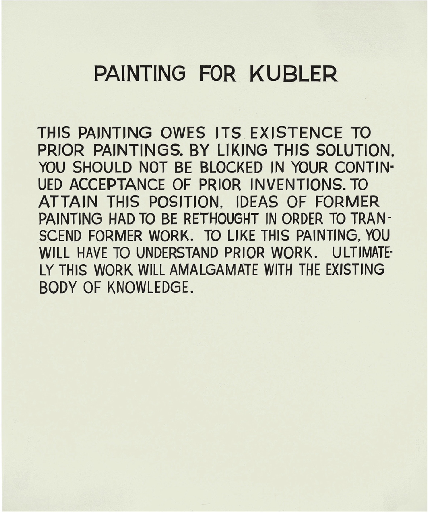
Similar to Costa’s “a piece that is…” this painting is self-referential but in a different way, it is literal and talks about itself and, using language and words to create a relationship between the content and its form, tells us how is it supposed to be experienced. We don’t fully know what previous work Baldessari is referencing, but we do know he’s making an ironic statement about the art historian George Kubler, and in particular to his book The Shape of Time, that discusses innovation and change in artworks through time.
So in theory you’re only able to understand this artwork if you understand something else, nothing like art for art’s sake, this piece is unable to be judged on its own terms. Kubler’s book discusses authorship, imitation, tradition and development of art history and Baldessari critiques, maybe mocks, all of it with this painting. And taking it even further by not even making the art himself but commissioning a sign painter to do it, he makes us question who is the real artist, is it the sign painter or Baldessari. Some additional info here: this artwork sold for $1,874,500 USD and here’s a video of Baldessari talking about his work.
If there’s one thing that I’ve learned in winemaking is that harvest is impossible to control or predict and we’re just doing our best at all times to adapt to the whims of the fruit, the weather, the land and a million other factors. So next week newsletter will come on Sunday or Monday, and if you want to see some of the very manual intensive labor that goes into making natural wine, you can follow Vino Potable on ig here.
Comments are open for chatting if there’s anything you enjoyed and want to discuss.
Thank you for reading and have a great week!