


Three diagrams to enjoy – Monday edition
On diagrams

Once again, writing from Itata Valley in Chile, where for the past five days I’ve been having 8 to 10hrs work days at the winery, in intensive physical work. Natural winemaking involves some machinery but mostly our labor, specially in the Latinamerican countryside, where resources are scarce. For our 2025 vintage, I can say almost with certainty that our hands (or feet, as we also do treading) touched every single one of the grapes used in the wines. Proud and exhausted, that’s the reason why this is a late Monday edition.

Today’s three things are tied by one of the oldest forms of human communication and one of my favorite things in the world: diagrams. Each thing will be one reason why I think diagrams are important plus an accompanying figure, of course, that I truly hope you enjoy. And if three diagrams are not enough (they’re not), I’m also linking my personal diagram archive at the end. I’ve been building it for five years and it has more than 400 hand-selected figures, I figure that could be enough (maybe not).
1. Diagrams helps us understand complex information
A first type of diagram is one that represents existing data with accuracy and in detail. Anyone interested in data visualization and graphs probably knows about Edward Tufte, American statistician and PhD in political science, his self-published(!) book “The Visual Display of Quantitative Information” is one of the most important sources about information design. The very first sentence of the first chapter of that book says “excellence in statistical graphics consists of complex ideas communicated with clarity, precision and efficiency”. This for me a great description of what a diagram is supposed to do: make complex information easy to parse.

These two figures represent the same information, with a key difference that one of them makes the reading almost effortless. We don’t need to go deep into the data to quickly grasp the differences between the four sets, because the visualization makes it clear and easy. Diagrams assist us in accessing and understanding complex information, relieving cognitive load, and by adding extra layers of information, like color coding, labels, arrows, or numbers, we’re able to do much more, and that brings us to the second thing.
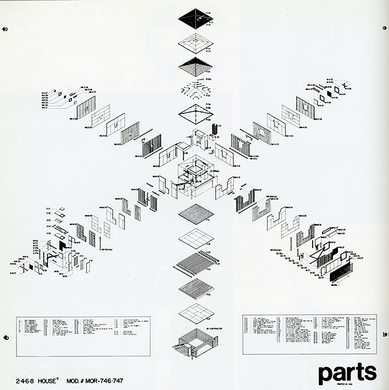
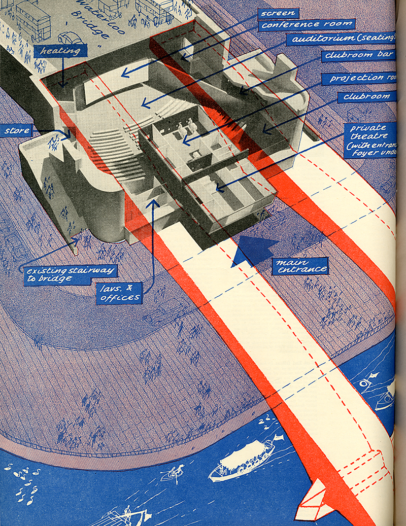
2. Diagrams augment information and show complexity
While Tufte talks about creating graphs out of existing data and with a great deal of accuracy, there’s a second type of diagram that represent existing elements accompanied by non-existing elements or concepts that complement and explain what it’s being depicted, adding new layers of information. There are many use cases for this type of diagrams: maps, schematics, assembly manuals, blueprints, and even dog agility course routines. In architecture, they’re used for early sketching, exploring geometry, showing parts, explaining functionalities, and discussing technical aspects in the context of a building: heating, circulation of people or air, landscaping, or natural light patterns.

This is a position diagram of one of my favorite buildings, the Mercedes Benz Museum by UN Studio made out of twists and turns, without a singular floor, all surfaces are in between levels allowing fluid transitions between spaces, like an exaggeration of the single spiral at the Guggenheim in New York City. Here’s an animation showing how the structure works. In this case, the diagram shows aspects that exist in the real building and depicts part of how the structure works while also augmenting the layers of information by adding color coded lines axis lines with measurements, and showcasing everything that is not actually on the real structure but makes up a part of the building itself and reveals part of the process of it being made.
3. Diagrams visualize concepts and abstractions
Lastly, a third type of diagram represent things that we cannot see, including one of my favorites: time, but also causal, spatial, functional or formal relationships between elements. Conceptual diagrams are abstract representations that help us think, solve problems and communicate. In the case of math and geometry, solve problems is quite literally, as diagrams not only outline but give instructions, rules and are used to create propositions. Euclid’s elements and propositions, including the creation of an equilateral triangle, are one of the oldest examples. Diagrams not only represent knowledge, but they help in creating knowledge, and their way of interacting with problems is unique, leading to the possibility of interpreting the information in novel ways.

Diagrammatic reasoning is said to be key for designers, architects, mathematicians, engineers, and even philosophers so it is not rare to find diagrams accompanying their work or theories. Making sense of things by drawing is also not uncommon, every explanatory napkin sketch that has ever existed could be considered a diagram, and they can even be compared to language: they introduce and communicate content.
As promised, here’s my are.na channel with the collection that I’ve been building for the past five years. The collection grew while I was writing this article, as well as my bookmarks on diagrams articles, I even found a conference that I would love to attend in 2026! Happy to share more about the articles and bookmarks if this is a topic you’re interested in.
Leave a comment if there’s any you particularly liked.
Have a great week!